Your Custom Text Here
CONTENT STRATEGY
Huge School
Problem:
Recommend a content strategy for Sur La Table's website and social media channels.
Solution:
An editorial guide, alongside an editorial calendar, that provides a set of guidelines on how to create content that inspires consumers with Sur La Table's spirit of cooking for the purpose of continual brand engagement. It provides directions on how to create, maintain, and promote content that helps consumers make informed decisions about their purchases to build brand loyalty and satisfaction.
Process:
For our final project in Content Strategy School, we were assigned a client for whom to design a series of strategic recommendations. I was to refresh the design of the Sur La Table website and improve it's editorial and e-commerce functionality. At my disposal was the entire Huge toolbox of content strategy tools.
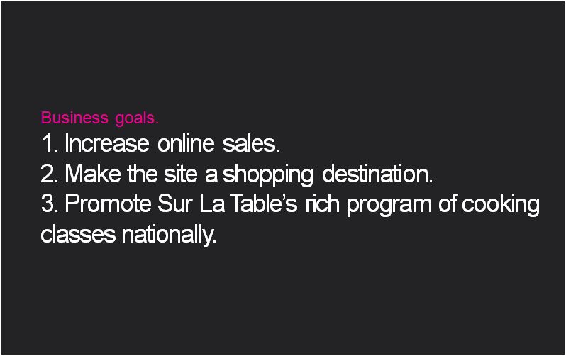
Initially, I audited the client's site and social media channels to understand the full range and reach of their content. Content audits require a very thorough examination, checking out the site section by section, page by page (not quite all, but a significant number). What were Sur La Table's breakthroughs and breakdowns? What content could be reused? Were there any essential pieces in the user shopping experience missing? What content goals should I define, and how were they doing in meeting their current business goals of: increasing online sales, making the site a shopping destination, and promoting their program of cooking classes?
Dumping all my findings into a spreadsheet, I categorized more than two hundred pages of their site into content types (2/3 of their site was comprised of information on cooking classes, and the remainder was broken down into product info, recipes, store locations, and editorial). I analyzed the structure of the home page and the messages behind the copy and visuals on the landing pages. I pinpointed the voice and tone in the headings, sub-headings, and imagery, and compared it to those used in their social channels, Facebook, Twitter, and Instagram. I gave user experience a hard look, studying the site for it's ease and clarity of navigation; redundancies in page content; metadata and structural requirements, with their implications for page lengths and readability. I studied offline brand extensions and looked at third-party blogs and reviews. I also looked for opportunities for expanded commerce. The available tools for purchasing goods and materials were shopping carts, registries, and gift cards (directly); indirectly, they were wish lists, social sharing, recipes.
Having studied the site, I focused my recommendation of fixing a few major problems. I'd identified three distinct user journeys that could be supported with the addition of new content types. Sur La Table customers come to the store of varying levels of expertise: some come by to buy gifts for others, while others come by to complete their hard-earned model kitchens. By anticipating their needs, we can better assist them with their purchase.
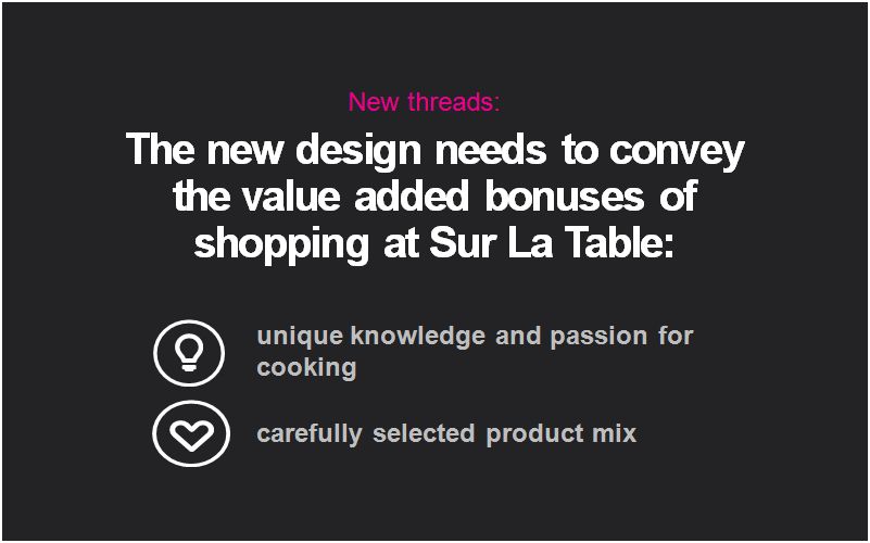
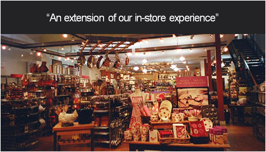
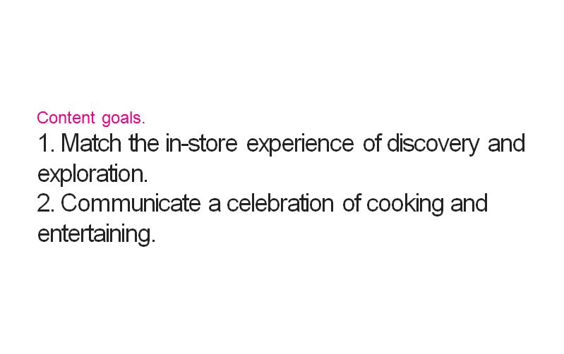
Early, ground-laying slides from the final presentation.
A page from the content audit explaining the organization of the site and the proportions of it allotted to each section.
Skills employed:
- Consulting
- Content auditing
- Editorial strategy
- Voice/tone
- Email strategy
- Production calendars
- Content modeling and information strategy
- Client-facing presentation skills
Based off the user journey, I recommended the content type that should be made available, as well as the language that should be used to differentiate them. One example is the addition of category landing pages. As is, the site has a three-part navigation tree, organized from broad category (cooking), to purpose (cookware), to category (skillets, or saute pans, or tagines). By clicking on a category, you can find all the items under that umbrella that break out into individual product pages (le creuset no. 1). While this is suitable for an expert shopper, many may come to the cookware portion of the navigation and stop cold. "What's the difference between a skillet and a saute pan? I just want to make a stir fry. Where do I go next?" By providing an intermediary page at the cookware level, that expands on the differences between the various product types, shoppers can make a more educated decisions for this shopping purchase, and the next. Even better, Sur La Table doesn't even need to create a lot of new content for it -- it has existing content in the form of videos and guides for shapes and functions and brands, only it's tucked away in the YouTube channel or the registry section.
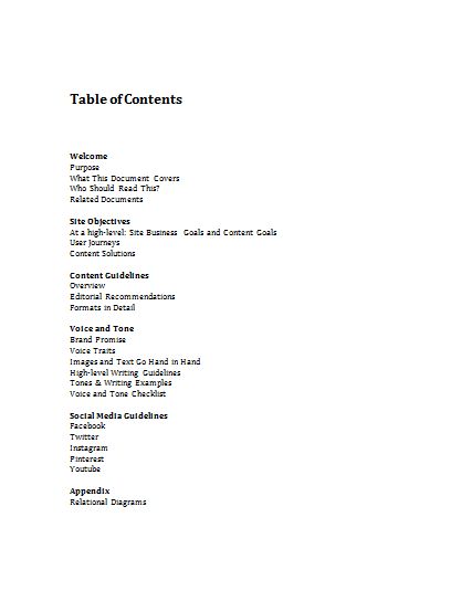
This editorial recommendations, and others, were spelled out in the Editorial Style Guide. A variety of tonal differences across the site had to be reconciled to make it a cohesive whole. The other editorial types I advocated, to amplify SLT's voice, enhance it's presence, and integrate it with it's offline channels, included: an interactive web catalog, chef profiles for their cooking classes, and a blog or newsfeed, to showcase their newest site additions (such as new products or recipes) and most popular social media content (a real strength of theirs). The point is to make such a gargantuan site easier to digest.
The editorial calendar turns these plans into action, ensuring the publication of the site’s evergreen content by the expected deadlines. It also sets the bar for new content to appear on the site and related channels with regularity.
OUTCOME:
I communicated the findings and deliverables by formal presentation to the Content Strategy staff at the end of Huge School. Staff provided some solid feedback and was happy with the results of the last couple of weeks.
Credits - the thumbnail image is property of Huge, Inc.
Excerpts from the Content Guidelines portion of the Style Guide.
The editorial guide is for content producers, editors, writers, marketing directors and managers, technical assistance providers, back-end database managers, and website managers. The guide is for consultation during content development to ensure that Sur La Table's brand attributes are carried throughout.
An editorial calendar - this one for a financial services client prescribing modular content types with sample topics for a three-month period.
