Your Custom Text Here
This Apple Watch app was a graduate school project for an Interaction Design Studio for Carnegie Mellon & The University of Madeira's Master's in Human-Computer Interaction (HCI) program. We created the design and prototype in three weeks.
PROBLEM
Create an interactive prototype that adapts a winning design concept from the Red Dot Awards for the Apple Watch platform using Quartz Composer.
SOLUTION
A combination time and weather app that visualizes three states through various interactions:
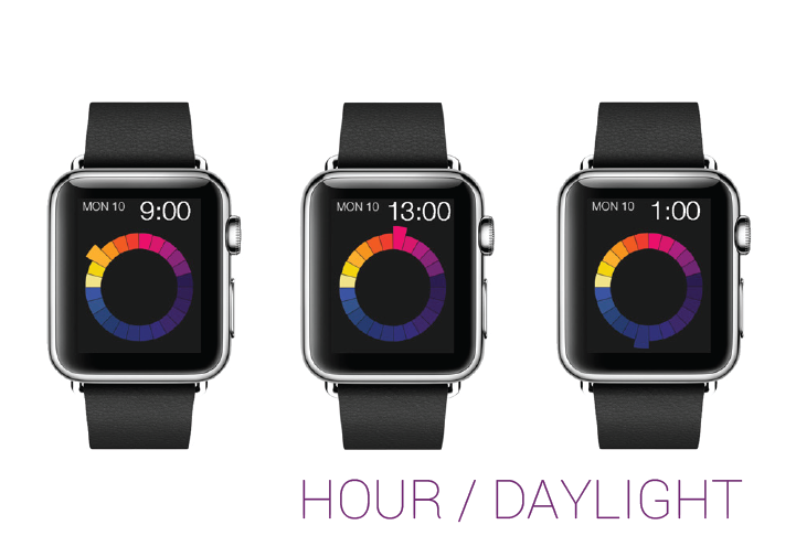
- time and hours of remaining sunlight //default status
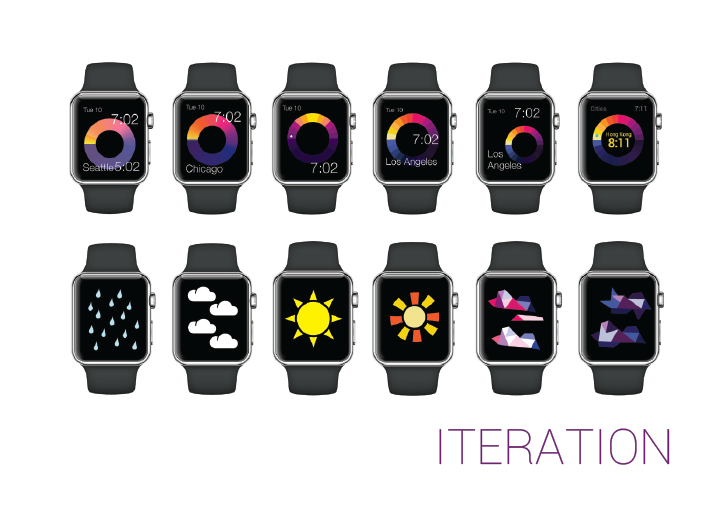
- the time in different cities //tilt the watch back
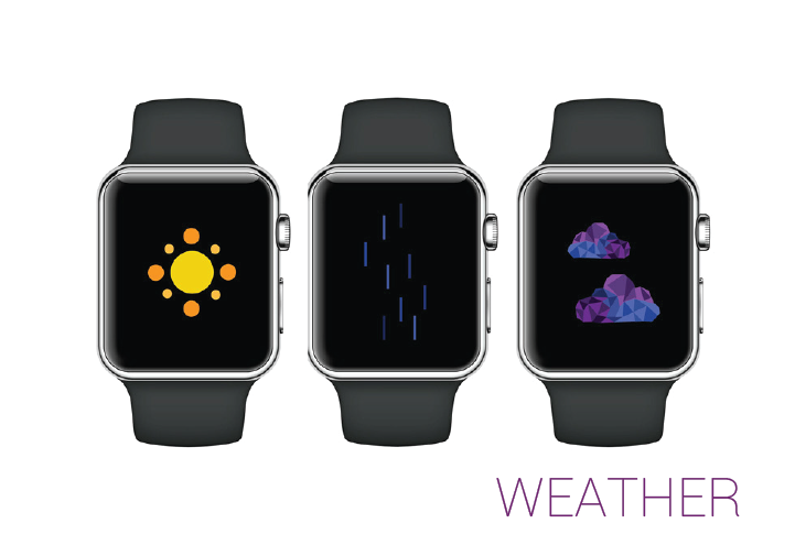
- an animated weather forecast //shake the watch
PROCESS
As a team, the three of us chose this piece because we appreciated how it used technology to reflect something natural – how the hands of the clock moved from east to west, and how it mirrored the metaphoric colors of the hours of the day. We wanted to take inspiration from this clock, but adapt it for 24-hour use and allow for user manipulating. Configuring the Apple watch with the iPhone, the watch could be used to show the time through visualizations, and the iPhone app could provide more information about the time of sunrise and sunset, astronomy and constellations, and even Greek mythology.
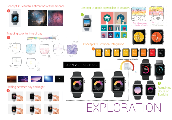
Initially, we transcribed this concept through completely different orientations, all taking the medium and the message into the account. Personally, I wanted to apply the style of the beautiful animations Apple had been using with it's blooming flowers. My teammates, both travelers and living with me in Portugal at the time, wanted to show what time it was in different cities, so you could know when to call. One of them wanted to reinforce that with icons from the various locations, though we quickly ran into problems with the number of iconic buildings and landscapes (and the large number of cities/towns you could input). Another one wanted to focus on integrating it with the Apple Watch's other apps and functionality, using those as constraints. She visualized some actions as shortcuts, or used text to indicate an alarm or time of sunrise/sunset.


SKILLS EMPLOYED:
- Interaction Design
- Animation
- Visual Design (weather)
While we agreed on having the colors change over the course of the day, to denote time passing, we came up with different ideas as to how. Exploring my original metaphor of space and time, I looked at some different avenues, including orbiting skies to indicate day and and stars to signify night, with distinct animations to explain transitions (e.g. exploding supernovas); using the color of the sky at that time of the day to supply the background and denote the changing light as the day progresses; animating the watch hands with fire, stars, and light to show the chance of the hour.
Ultimately, we decided it'd be best to aim for an abstracted version of the 24 hours of the day, with the main goal of showing people the number of remaining hours of daylight, to encourage a fuller, more active use of daylight hours. We iterated with moving dots, lines, and segments to indicate where on the scale of daylight the user currently was. A brighter, sunnier-colored top half of the circle represented daytime, whereas a darker, evening-colored sky pointed out nighttime.
Additionally, we had to settle on what our principal interactions would be. When you take a moment to check the time, what else might you be looking for? For one, if you it's an appropriate time to catch up with someone in a different time zone. For two, what the weather may be like, in case you are planning on stepping outside. With the apple watch on the wrist, we didn't want to force any unnatural gestures. With the first example, turning your wrist over, as if you were turning over a snow globe, would allow you to cycle through time zones, and return to yours, easily. With the second, shaking your wrist would trigger a weather-related animation, giving you a quick idea of what the outdoor conditions were like. Blinking rays mean sunny; falling drops means rain; and drifting clouds means cloudy.
Working with a team necessitates respect and tolerance for others' ideas, and done right, means that you have more inspiration to work with. Stimulating the growth of each others' ideas is important to keep creativity and engagement high. In the end, individual sacrifices are made for the best vision possible.
OUTCOME
We built the wireframes in Adobe Illustrator before creating the animations of moving time and the weather in Quartz Composer. The next step was to simulate them using Origami, which was unfortunately uncooperative.
For Interaction Design Studio 2015, with the collaboration of my teammates, Nalena Santiago and Danita Delce


